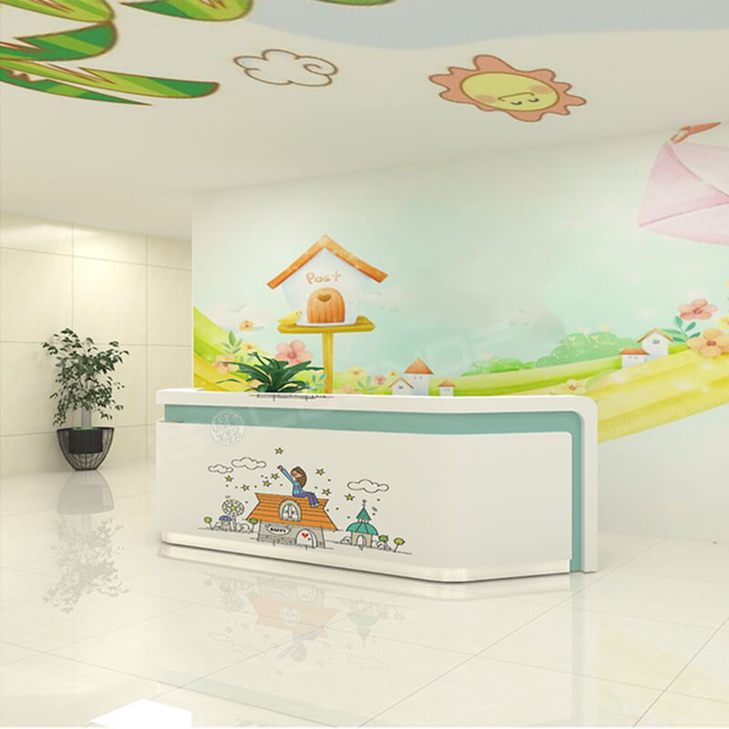
Children’s hospital furniture positioning design ideas
Pediatric clinic positioning in the interest, fairy tale, fully take care of children’s psychology, with bright and cheerful colors, rounded arc lines, cartoon modeling elements, let children like exposure to the fairy tale world, relieve children’s fear. The furniture is designed with rounded corners to avoid collisions. In the design, the spatial priority is clear, clear layout of each functional area, reasonable distribution of children’s entertainment facilities, pay attention to the internal connection of each area, reasonable arrangement.
The children’s hospital furniture has a green theme
The color of the whole design is mainly green, blue and yellow. The whole space is very affinity, which can make people feel warm, comfortable and vitality on the whole, and can relieve the nervous mood of small patients.
Forest, sea and animals can meet the aesthetic needs of children. Curves and circles create a flowing, light, soft and flexible space feeling. Sufficient natural light creates a good light environment for children, so that small patients can feel bright and warm, enriching children’s visual experience to the greatest extent and eliminating their fear of hospital.

The symbolic significance and unique and emotional expression of art are unmatched by any other modeling methods, which can shorten the distance and increase the intimacy with children.
Compared with general hospitals, pediatric clinics are small in scale and have relatively simple functions. Therefore, in a small space, they should not only meet the psychological needs of children but also make the functional design of the whole clinic reasonable and simple.
Create a comfortable environment full of childlike interest
The design of the hospital, full of childlike interest, is a comfortable environment for both patients and medical staff. The design method seems simple, but in fact, it is also well considered, which is very suitable for this functional space. Like a real children’s playground and many schools, it’s colorful. Due to the particularity of the hospital, the colors used are mostly light tones, gentle colors that can make people feel soothing and hopeful. The designers at Toormix also made extensive use of warm wood and other natural materials, bright but soft lighting, and the interiors were designed to be flexible, cute and non-invasive.
The hospital is divided into waiting rooms, medical consultation areas (consultation areas) and treatment areas. Three different areas have different themes — “nature”, “universe” and “racing track”. Based on different themes, these individual partitions have their own unique interior decoration. The nature-themed waiting room, for example, is decorated with wood panels with cartoon patterns of trees, mountains, clouds and owls, while different levels of green are used for furniture and lighting. In the medical examination area, the theme is space, using decorative patterns such as planets, rockets, spaceships and so on.
Different areas have different decorative themes
In fact, the wall decoration is the biggest highlight of the hospital interior design. They are fun, and some have a story, which is a great distraction for children at the doctor’s office and makes the hospital a comfortable space to stimulate their curiosity and imagination. Toormix design studio is very good at graphic design, and has done a lot of clever brand packaging projects in the past. This hospital actually has a whole pattern recognition system. In addition to the wall decoration, the practical signs, street signs and room numbers are all designed in a playful way, which gives the hospital a unique brand image.
Design of diagnostic table and chair furniture in pediatric hospital
1, color jump. Using light blue as the main color, with two lovely shapes of dolphins, give children a sense of intimacy.
2, intimate rounded corner design desktop corner uses intimate right Angle into rounded corner processing, in order to avoid children or patients accidentally hit the danger.
3, the legs of the round corner slip diagnosis table leg cylindrical design, better to save space, and close to the anti-slip design, to avoid accidents and slip.
Shandong iGolden Furniture Co., Ltd. was established in 2012 in Jinan City, Shandong Province which is one of the biggest professional manufacturers of furniture and board. Such as hospital furniture, bank furniture various customized office furniture,Aluminum honeycomb panel and compact laminate board. iGOLDENOF is a large-scale manufacturing enterprise integrating design, development, production and sales. In past ten years, IGOLDENOF has insisted on open-mindedness, solidarity, mutual assistance, hardworking, pragmatic and humble entrepreneurial spirit and the pursuit of excellence who has been highly recognized and appraised by customers from all over the world.
